
Artists Talk: "Spot On"
The following is an edited transcript of a conversation that took place on February 21, 2026, at 68 Prince Street Gallery in Kingston, NY, with Sharon Butler, Jason Travers, and curator Alan Goolman
Alan Goolman
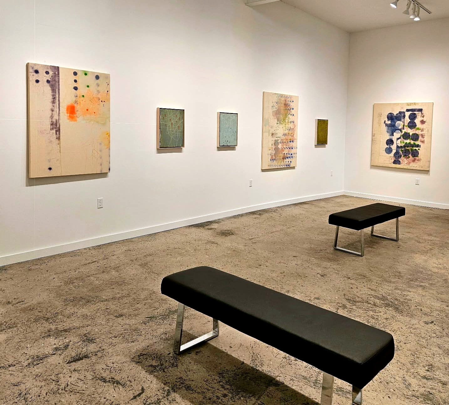
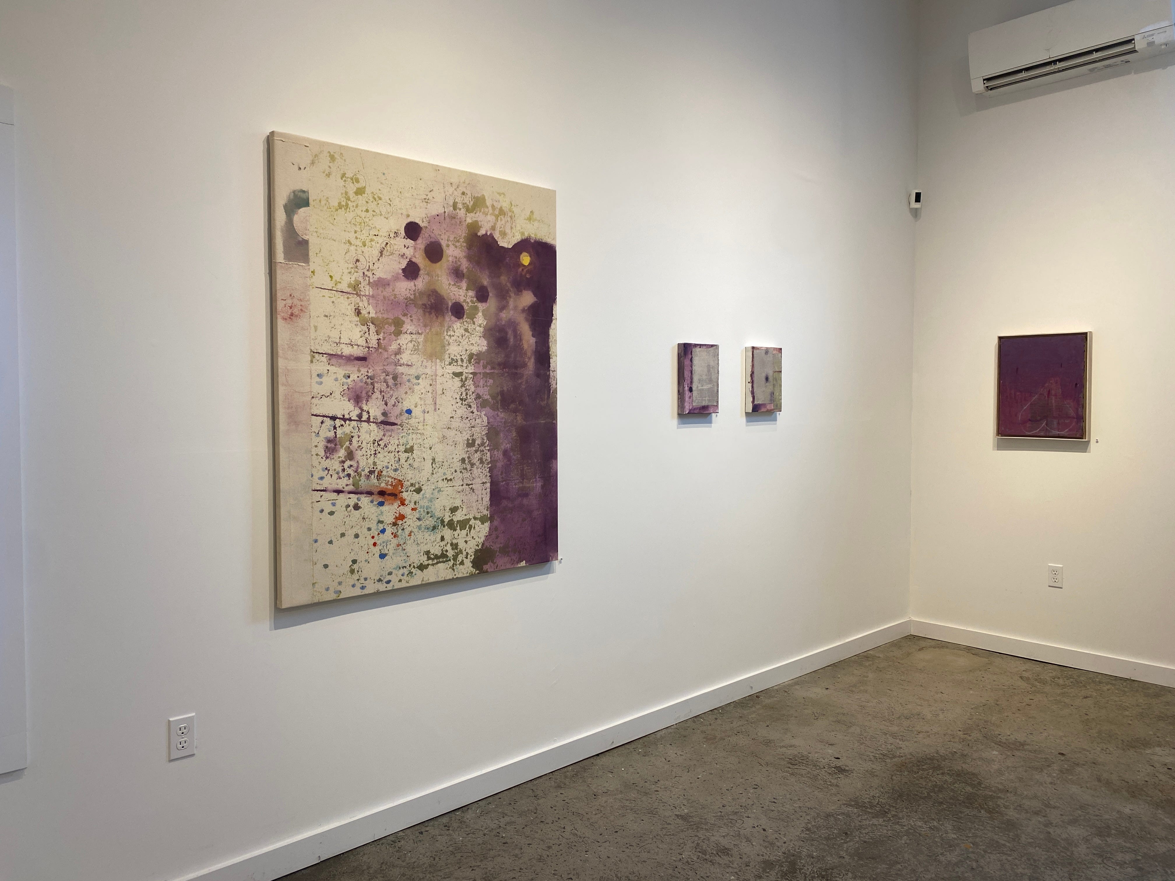
Thank you all for braving the weather to join us for this conversation between Sharon Butler and Jason Travers. For “Spot On,” I’ve tried to work within a framework or narrative. Sharon and Jason provided all the color and texture, and most importantly, the marks, or spots. Interestingly, the “Spot On” narrative began with a Murray Hockman painting in the front gallery — what I came to learn was that when spray paint cans begin to freeze, they can no longer spray — they spatter. That spatter is how I landed on the title “Spot On,” and I set out to piece together the rest of the exhibition. I can’t quite remember how it all came together — I can’t remember if I saw Sharon’s or Jason’s work first. I think I had seen Jason’s work; while clearly rooted in impressionism and landscape, his color, surface textures, and mark-making drew me in. His paintings were perfect for the narrative. I still have no idea how I found Sharon, or what led me to LIC to see Sharon’s work. Abstract Expressionism, Geometric Abstraction, Color Field, and Stain Painting are all within my wheelhouse and all within Sharon’s practice. When everything finally came together in the gallery, it was almost like creating sentences or writing a book. Sharon’s yellow painting is the cover. That one is a single statement. A single page. These paintings, turning the corner, create a sentence. Looking at another full sentence. This is a really interesting concept. It’s pretty clear that color drove me, though I’m not sure I had anything specific in mind as I was assembling things; everything came together. What you have are two extraordinarily diverse painters interacting seamlessly.
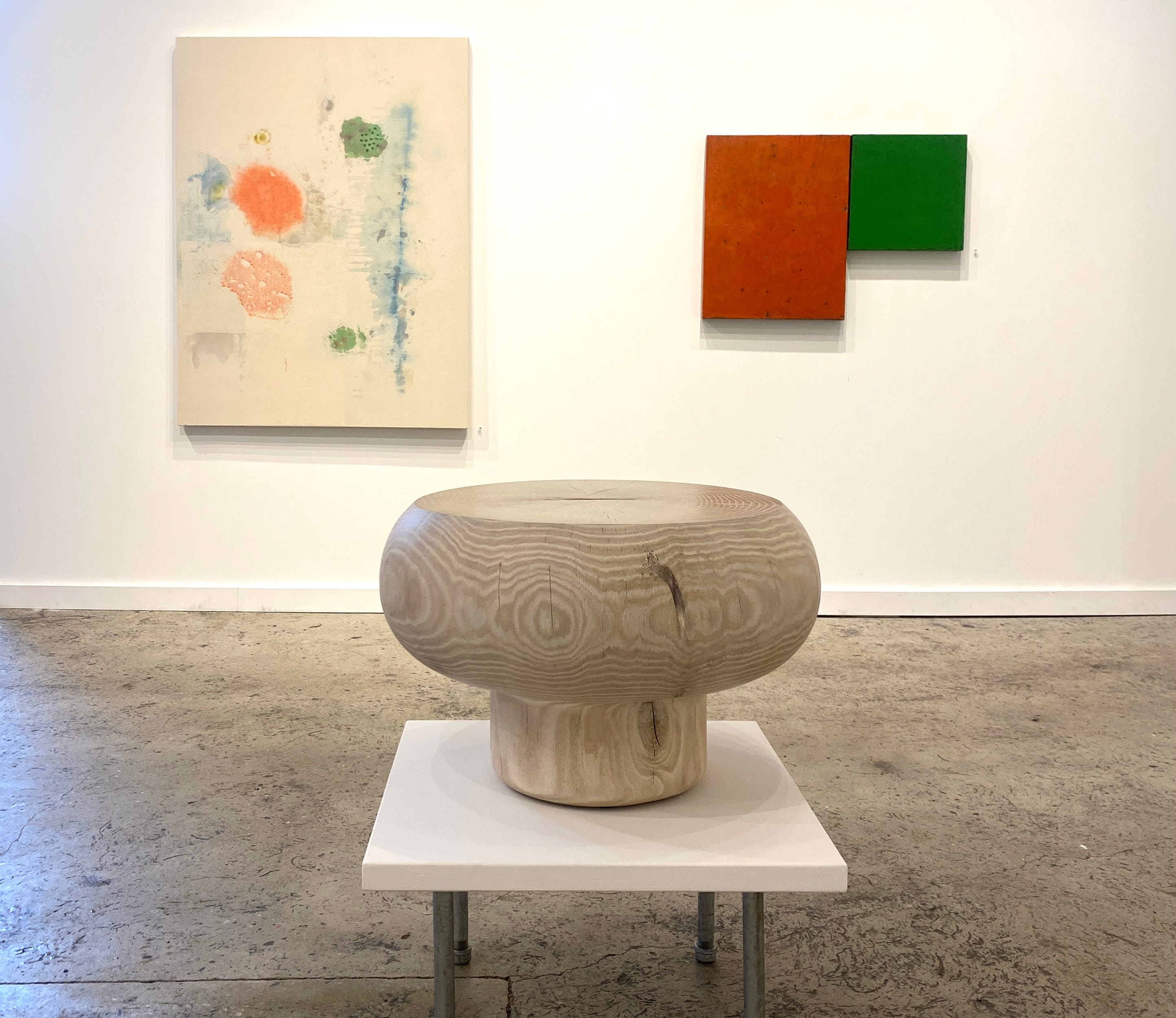
In the front gallery, 91-year-old artist Murray Hochman, mentioned before, and the beautiful work of Eileen Power, on paper and carved in stone are on view. Woodworker and sculptor Kieran Kinsella was brought into the show at the last minute. In my narrative, his objects represent punctuation marks. Periods at the ends of the sentences. We sold that piece earlier. I’m so thrilled. I’ll leave it here and let Sharon and Jason take over. Thank you all so much for being here.
Sharon Butler
Thank you, Alan. for the beautiful introduction.
Jason Travers
Yes, I came in two weeks ago — I wanted to make sure I saw the show before the opening. When I walked into this room, my jaw dropped. My only response was that I felt like I was working with an aesthetic sibling. Alan did such a great job. I think everyone should be commended—Alan, David, and Paula—for how the work came together. This show really harmonizes.
Sharon
Alan has an incredibly sensitive eye for color, and the pairings of the work are really thoughtful and visually compelling. They bring something out of my paintings that I hadn’t seen there before. For example, that green area — I never really thought of it as having that much green, but paired with your green painting, they both just sing.
Jason
And that’s what you want in a group show, right? You want the work to augment each other and bring out strengths in each other’s paintings.
Sharon
Do you consider those spots?
Jason
I’m not sure what to call them. I actually think of them as dots or maybe points. I’ve been working with little dots (or points) for a long time. When they first appeared, I was using them strictly as a formal element— I was looking for a way for the dots to hold space. But you can’t put two dots in a field without creating some kind of relationship, an implied movement. I eventually stopped seeing them as a formal element and started seeing them in a more metaphorical, more poetic way — where they create tension. I was fascinated by this. My mind went to billiard balls, how they imply movement, attraction, and repulsion. From there, I began thinking about movement on a microcosmic and/or macrocosmic level. They re-enact the movement of particles moving through space, whether they are galaxies, atomic particles, or starling murmuration. More recently, when I look at them, I see them in a much more fairy-tale way. To me, they feel very much like footprints. I like that footprints imply both absence and presence— like something is there, even though you’re not seeing it now. So the dots in my paintings are my invitation. They’re my footprints as I walk through the work, and I hope people follow.
Sharon
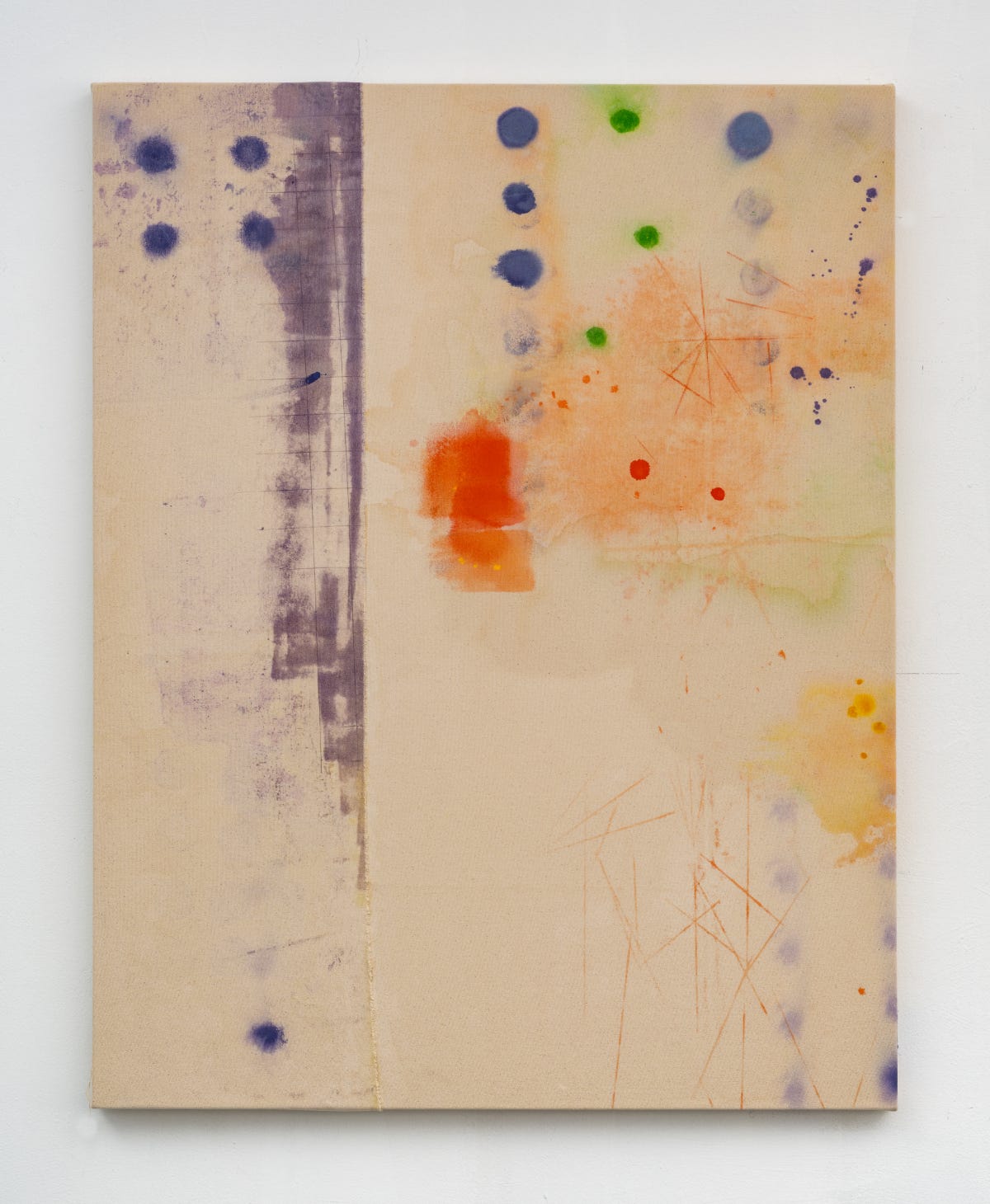
I have a similar experience. I started, of course, working with all geometric shapes, and this is the first body of work where I’ve narrowed it down to circles. The meaning of the shape shifts over time. At first, geometry was a way of reducing imagery so you could really focus on the relationships between shapes — relationships that become metaphorical. Geometric form also reflects the world around me; I live in the city. When I started this body of work, I had just moved to a beautiful new studio in Long Island City, with a view of all the rooftops, their vents and pipes.
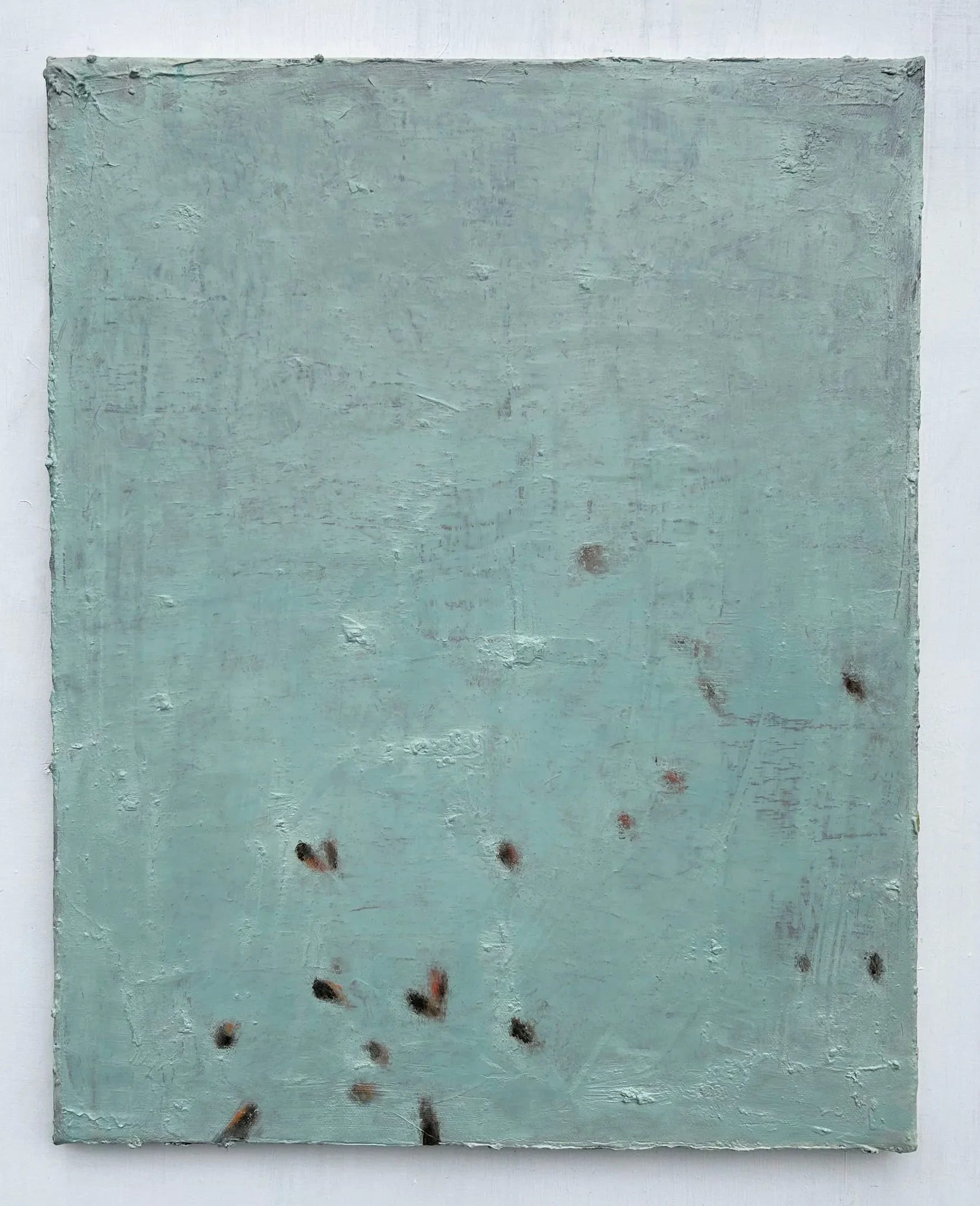
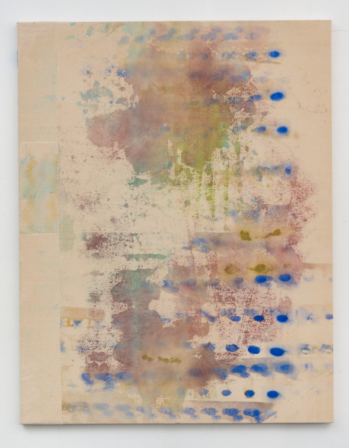
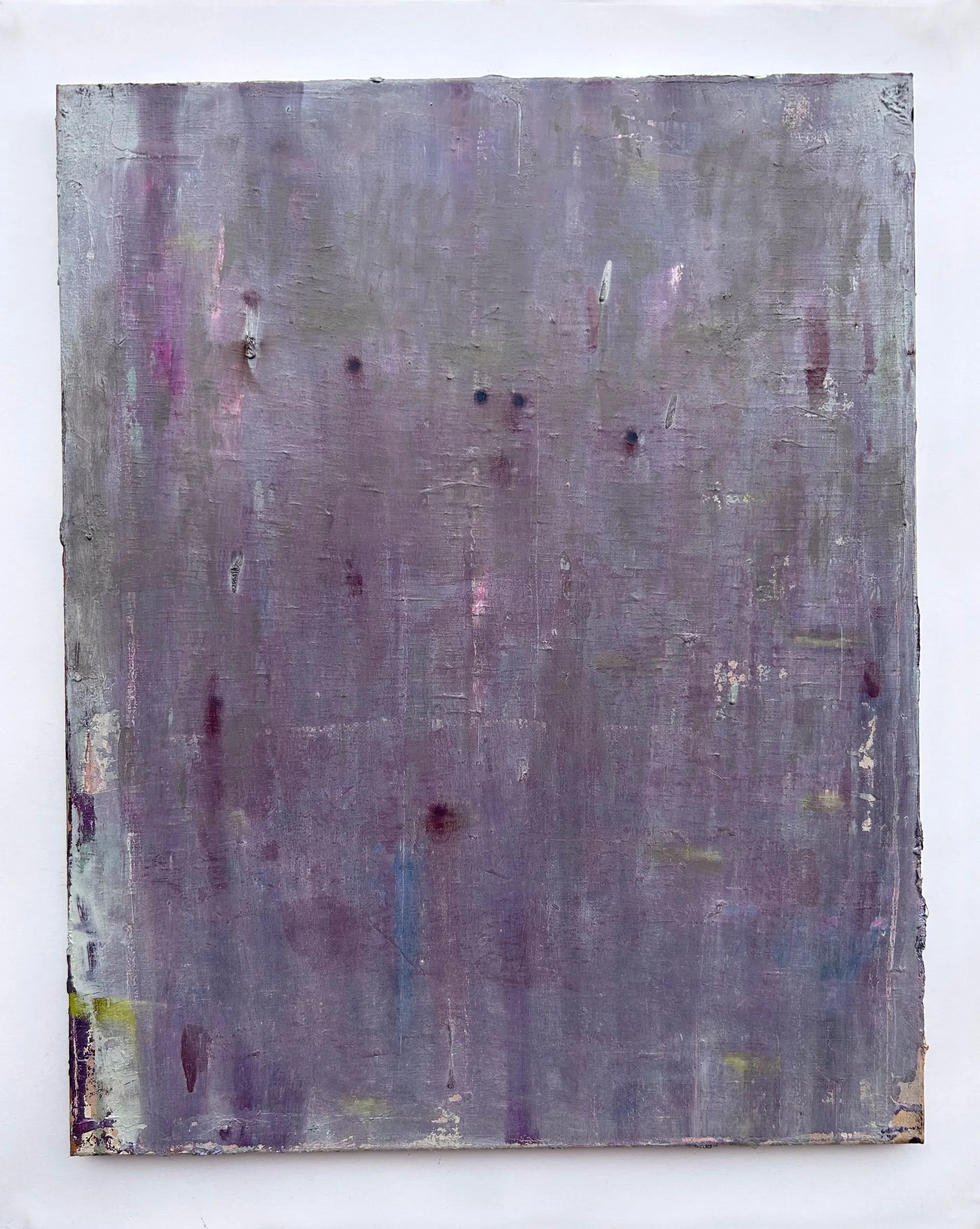
The circle is a perfect shape — organic yet mechanical. I learned in Tony Pratt’s drawing class when I was a grad student that it’s very hard to draw a perfect circle, and even harder to draw a perfect ellipse. An ellipse is a circle in perspective, and there’s a very precise scientific way to draw one. I remember making a body of work that involved trying to draw a perfect ellipse—an unattainable goal. That was the idea behind a whole body of work. But the circle also represents a kind of truth. For instance (picks up a cup), we know that this cup’s rim is a circle, but when we look at it, we see an ellipse—it’s just perspective. We rarely see a true circle in the world unless it’s a sphere, and on a two-dimensional surface, of course, a sphere becomes a circle. Now that I’m working on raw canvas, the circles become spots like the kind you get on your shirt—they soak in.
Jason
So now you’re moving from perfection to imperfection.
Sharon
Exactly.
Jason
I like that you bring up geometry, because part of why I like working with circles — or spots, or dots, whatever you want to call them — is that when you parcel them out on a canvas, they inevitably imply geometry. Our minds are always inclined to connect the dots, draw lines between them. As a young art student, I was trained by formalists. All my professors drilled into us the importance of allegiance to the grid. I rebelled against this later on. In a way, I’m a recovering formalist. I became more interested in telling stories, in tapping into the poetic. The importance of the grid can be de-emphasized if you remove the line but retain the point traces. In some of your work, Sharon, I can see that the points still conform to a grid-like structure, even though the grid is no longer there—they imply it without being overt.
Sharon
Right.
Jason
And that brings us to what we do as children with connect-the-dots drawings. The structure is there, but it’s invisible. You’re not giving it away too quickly. You’re leaving it to be discovered later on.
Sharon
There’s something too about the feeling of a ramshackle grid – it has completely different associations than a perfect grid. Circles are often found in patterns, but when they’re not arranged symmetrically, they’re no longer a pattern.
Jason
And what does that mean to you? I almost see a sense of time — you can imply time.
Sharon
I like the imperfection of it — the intuitive placement rather than the system-driven one. I think of geometry as having the least emotional content of all subject matter. On a scale, I’d put geometric diagrams at the more intellectual, machine-like end, and something like Thomas Kinkade at the other end — a kind of mawkish sentimentality. In between, there’s a whole spectrum of emotional content, and my work has always been about finding a sweet spot on that scale that reflects my circumstances. For a period, I would take geometric forms and digital drawings that looked like IKEA diagrams — and change their context to give them emotional content. The paintings in this show begin dissolving the geometry. Someone who is not familiar with my older work might look at it and call me a neo abstract-expressionist, but for me, it is all about the geometric shapes. This body of work was a long time coming — and I have arrived at a more feeling-oriented approach rather than a conceptually oriented one.
Jason, your work strikes me as Romantic.
Jason
I appreciate that.
I definitely feel like my roots are in the Romantic tradition — you can draw a line all the way from 19th-century romanticism up to the present. For me, it’s about connecting with the “awe”, eliciting deep feeling. I would like my paintings not only to be seen but to be felt. I don’t want to give everything away too quickly — I want the paintings to open up slowly. I’m still very much interested in sensory experience: obtaining information through the senses, whether through sight, sound, or touch. I want my paintings to reenact those kinds of sensory experiences found in nature. It’s about that whole range you’re describing between intellect and emotion; I’m always trying to find that sweet spot, too.
Sharon
And the materials, too. Those thick, luscious surfaces.
Jason
Well, doubt is my best friend. The surfaces come about not just because I like surfaces, but because there’s always reworking. What am I looking for when I work on the surfaces? A specific light sensibility. Alan mentioned landscape painting earlier, and landscape painting was very important to me as a young student — not just because I liked being outdoors, but because what I was trying to get from the landscape was not a pictorial representation so much as a certain emotion, a certain mood. That’s fueled by my interest in Romanticism. What draws me to the landscape is the feeling that light, space, and color are all united there. Even though I’m not painting from the landscape anymore, I’m still motivated by seeking a harmony between light, space, and color. The question for me is: how can I get the surfaces to elicit light, to create a sense of space, to achieve luminous color? These paintings aren’t about bright, high-key color — it’s more about how to get luminosity. The trick was layer upon layer, scraping away old layers, allowing the color underneath to come through. I found the luminosity to be more effective if I alternated warm and cool washes over each other. When I get it right, the color breathes — the canvas glows. That’s what I was always looking for in landscape painting, and what I continue to look for.
Your paintings arrive at the same place, I think, though in a very different way.
Sharon
About two years ago, I was working on canvases in oil — reworking and reworking and reworking. I was full of doubt. For many years, doubt was my friend, too. But I grew tired of the struggle. Some artists believe that painting is about struggle, but I thought: what if it’s not? made new rules for myself. One layer of paint. Before that, I should mention, I had done a whole series of work on paper in watercolor, double-sided, very small, soaked, and stained. I loved the water-based media. How could I do that with oil? I couldn’t, so I switched to acrylic and water-based media, and that was a game-changer. I could work on unstretched, unprimed canvas and just enjoy the process rather than struggling every day, knowing I’d have to wait a week or two for it to dry so I could go back into it. The moment I switched to acrylic, the whole world opened up. One of my rules was that I wouldn’t overpaint — but if the first go was a disaster, I could paste raw pieces of canvas on top and start fresh. It’s always about beginnings, not looking for a resolution. I call it my period of non-suffering. I had a studio visit with Mimi Park, a gallerist from Seoul, and she was thinking about something similar. One of the ideas she was exploring was a Buddhist concept of non-suffering. I started thinking about it and realized it would be an interesting approach. How would you translate that into painting? One thing led to another, and here I am.
Jason
By doing that, you’re giving yourself a lot of trust and a lot of freedom — which I can’t quite manage myself. I always go into the studio saying I want that trust, that freedom. Then the next day I go in and think: no, no, it needs more red.
So what’s the trick?
Sharon
The trick is that I often piece together more than one canvas. These canvases are all two-sided — if you turn them over, you can see the painting that wasn’t chosen. And given that, I can tear canvases apart, turn one side over, and put the back with the front, so I have many more options. It’s not just about whether something works or needs to be painted over. I have many more moves now. I’ve got new tricks.
Let’s talk a little more about abstraction. Do you see your paintings as abstractions or something else?
Jason
Well, first of all, I love the question: what exactly is an abstraction? It’s a conversation I like to have.
Sharon
The reason I was asking is that when I look at your work, it has a specificity — for instance, in this one, I see fireflies in the evening. I can assign some kind of visual meaning to it. I was wondering if it works that way for you.
Jason
When people ask whether these are abstractions, I’d say they’re abstractions in the sense that there’s always a level of abstraction in painting, even in highly representational work. But my sensibility is more empirical. The things that excite me visually are things I see in the world: the color of a split stone, old driftwood, the color of atmosphere at a certain time of day. The colors I gravitate towards are grounded in natural observation. So I don’t really consider my paintings to be abstractions, because they always hearken back to some kind of sensory experience. I don’t really like the word ‘abstract.’
Sharon
It implies something generic, generalized.
Jason
Well, everybody has their own definition of what ‘abstraction’ is. The word has completely lost its meaning. Usually, when people use the word, they mean some kind of false dichotomy between representational and non-representational painting. I don’t think it’s that simple. I see it more as a spectrum. Vermeer, for example — I think of him as having a high level of abstraction. His paintings have grids that are as tight as Mondrian’s.
And who can be more purely ‘abstract’ than Mondrian? But even the purity of Mondrian starts with the sensory. Think of his series of pier and ocean. He was struck by sunlight scintillating off the surface of water. When he paints it, though, he doesn’t replicate it— instead he makes a parallel to it. Mondrian was distilling, not abstracting. It begs the question whether he’s as pure an abstract painter as he’s meant to be. Even in his Broadway Boogie Woogie he’s responding to the pace of New York City. People don’t always recognize how he was reacting to the everyday, the visual world. He was a very playful artist.
I think about him when I’m in my studio — how he distills from experience. I consider him perhaps the best example of what people call an ‘abstract’ artist, yet he’s still rooted in that empirical, sensory intake.
Sharon
The best abstraction brings in experience from everyday life.
What about politics? When I think about abstraction, it seems like the perfect idiom for speaking about political ideas. Have you thought about that?
Jason
I pretend not to — when my studio door shuts, the world gets shut out with it. I fume about politics, but once I’m in the studio, I want it to be a pure space. At the same time, I think politics inevitably comes through. A few years ago, when I went to my studio, I would begin my morning by working on paper. I began doing a whole series of sinking ships — because that’s how I felt things were going. I’ve never brought it out into a painting directly. I have a Philip Guston quote from the 1960s, during Vietnam, on my studio wall, which I identify with— something to the effect of: ‘Who am I to go into the ivory tower of my studio and pretend the most important thing is changing a blue to a green when all of this shit is going on? He clearly felt some guilt about that. I’ve had that quote up since 2003, during the Iraq War, back when we thought America was at its lowest. I struggle with those same questions: what are we doing as artists? Why are we making paintings when there are so many more important things happening in the world? And whenever I talk with other artists, I always ask: What is our role here?
Sharon
Some artists are naturally drawn to expressing political ideas in their work — politics is their obsession, their subject matter, their content. But not all artists are, and for some of us — I think for both of us — it’s a refuge from terrible times. I publish Two Coats of Paint, and I think about political content there. I feel like if people want politics, they can read the Guardian, the New York Times, or Hyperallergic. Two Coats of Paint isn’t denying there’s a situation, but that we need more than that in our lives. I feel the same way about painting.I also rely on materials and processes as metaphors for events in the world. You could see the process of non-struggle on one hand, but on the other, it’s also a process of dissolution. Isn’t the world as we know it in the process of dissolving? I look at the processes of tearing, mending, and soaking as metaphors. Not about politics per se, but I think the way I work reflects something about the times we’re living through.
Jason
I keep going back to that sinking ship analogy. It’s sometimes lost that even on the sinking Titanic there was hope for humanity. While it was sinking, there was a string quartet playing for panicked passengers. These musicians kept playing while the ship went down. The man who led that quartet was Wallace Hartley. I don’t want his name to be forgotten. There was a time when I would think about him and feel angry— why are you playing music when you should be getting on one of those boats? Now I look back at his contribution differently, and I do think it was a contribution. He was doing the only thing he could do. He was restoring a sense of humanity at the moment it was most needed — even if no one was listening. In a way, that’s the analogy for the artist today. I feel like Wallace Hartley — playing music while the whole world is falling apart and nobody’s paying attention.
Sharon
I had the same feeling about Morandi, who lived through the wars in Italy. How could he keep making those paintings of jars and vases? Now I understand why he wasn’t out in the streets — or maybe he was, but his practice continued. And I think that’s something about being an artist. Painting is a lifelong practice. I’m not going to let them ruin my life. You have to keep going. Don’t be an ostrich with your head in the sand — stay aware — but perhaps continuing to work is a small act of resistance.
Jason
I do sometimes feel like I might be burying my head in the studio. Part of me says I should be doing more, but at the same time I believe in the redemptive power of art — not just for myself, but for all of humanity. On days when I feel the artist’s role is heroic, I think of artists as the last shamans. In pre-industrial society, the shaman was a mediator, communicating with forces that others couldn’t communicate with. In an industrialized society, there are no longer shamans, though we need them. I feel like it’s now the artist’s role. Perhaps I read a bit too much about shamanism. (laughs)
Sharon
Does anyone have questions or thoughts to add?
Audience Q&A
Audience Member (Speaker 4)
I’m curious about the spatial quality in both of your works — it’s as if the universe expands. Could you talk more about that?
Sharon
I use multiple pieces of canvas, which disrupt the space — bringing the painting into your space. Suddenly, you’re aware that you’re looking at an object, not looking through the traditional window of a painting. Although I do like the play of space within the picture plane, especially on this one (points to Extratropical), there’s an illusion of movement from the stuttering.
Jason
For me, space can mean different things. There’s the physicality of the canvas, but coming from a more representational background, I still think of the canvas as having possibilities — you can paint on the surface, or behind the grid, or in front of it. I try to hold a space that has a bit of foreground, middle ground, and background, but not held together by conventional perspective — it’s more about the layering of the surface. I want you to be able to look into the paintings, not just be aware of the surface. Almost like looking at a layer of ice on a pond — you’re aware of the surface, but there’s also a world beyond it.
Audience Member
There’s a real sense of depth even though it’s so light — like air. The difference between the subtly stained areas and the stronger shapes that sit in front creates something that feels alarmingly deep. I also wanted to ask: was there any intention when you started? Is there something you begin thinking this one is going to be about?
Sharon
The process guides me. I work on unstretched canvas — five canvases on a big table. I wet them all, the water soaks in, then I add paint. Then I flip one over, add more paint or draw on the other side, and reshuffle the order. They’re staining each other — each one has marks made on it, and marks absorbed from other canvases are bleeding through. It’s not until the next day, when they’re dry, that I really see what’s going on. Then I put them up, and I can see those spatial situations. I’m interested in the five ways we can create the illusion of space on canvas: position on the canvas, overlapping, color and value shifts, size, and perspective. I like to play with all of them.
Jason
That’s fascinating, because I have a similar process. I usually work on a larger scale, but I also have these 16-by-20 canvases that I buy by the box. I lay them on the floor to catch the paint dripping and scrapings from the paintings above. When I scrape, and the doubt creeps in, the paint falls onto those canvases, and it’s a great way to get the surfaces started. They start off almost randomly. I don’t take them seriously until I do — until you start looking at them and things begin to happen. That’s when I impose more order on them. They became a kind of practice for the bigger ones. And I found I was giving myself more permission, more freedom with the smaller ones. At a certain point, the interesting things were happening on the small ones, not the big ones. Then, of course, they went back and forth, influencing each other.
Audience Member 2 (Speaker 5)
It’s great to hear you talk about the distinction between intuition and intention. Jason, when you lean those store-bought canvases on the floor, it’s with the expectation that you’re going to splash — so there’s some oblique determination there. And Sharon, when you cut up those canvases, something other than pure luck is guiding the scissors. There’s a very astute bit of editing before the work achieves its final form. And editing a blog and editing a painting share certain existential connections.And the sweet spot you both mentioned, Jason — what were the terms? I wrote down ‘visuality and feeling.’
Jason
Visuality and feeling?
Audience Member 2
Yes — visuality and feeling. And that raises the question: what part of visuality isn’t already occupied by feeling?
Sharon
For me, it’s the intellect — or the tension between intellect and emotion. I studied art history during the minimalist era, and many of my teachers later on were of that generation. The idea was the thing — you start with the idea and execute a serial project. It wasn’t until later that I began to think about emotional content. All art contains both, but you have to decide where you’re going to land on that scale.
Audience member
Do you decide, or does it just happen?
Sharon
I decide. I was making these dark, pastoral landscapes — multi-panel pieces, a combination I used to describe as Ellsworth Kelly meets the Barbizon School. They did well — shows, sales — and I just thought, I can’t do this anymore. It’s too easy. I want to make something more challenging. So I brought geometry to the foreground, equating geometry with science and intellect. This is something I later discovered when reading about Helen Frankenthaler’s generation: after World War II, those painters were trying to eliminate geometry from their work because they saw it as science, and equated science with the atom bomb. Abstract expressionism was, in part, an attempt to embrace humanity and feeling rather than the mechanical. That was a revelation — I only read this last year.
Audience Member 2
Frankenthaler said she wanted forms for which no language would apply.
Jason
That’s the magic, isn’t it? We’re visual artists — not necessarily verbal. How do you put words to something that’s ultimately intuitive, that happens in a visual way? I don’t know the answer. And when I get too much into my head in the studio, thinking in words, the painting doesn’t hold together. I find myself constantly painting away from words.
Audience Member 2
Both of you are clearly very intelligent, which underscores how limited intelligence can be as a tool in the studio.
Sharon
One of my first painting teachers [Rob Moore at MassArt] told me I think too much. And, yes, it can get in the way.
Audience Member 2
Absolutely.
Sharon
But Jason and I have both developed processes that enable us to sidestep the intellect — at least for a time, until we get to the stage of looking and evaluating.
Jason
Or you just have someone else talk about it for you. That’s what the critic is for.
Sharon
Exactly. Any other questions?
Audience Member 3 (Speaker 6)
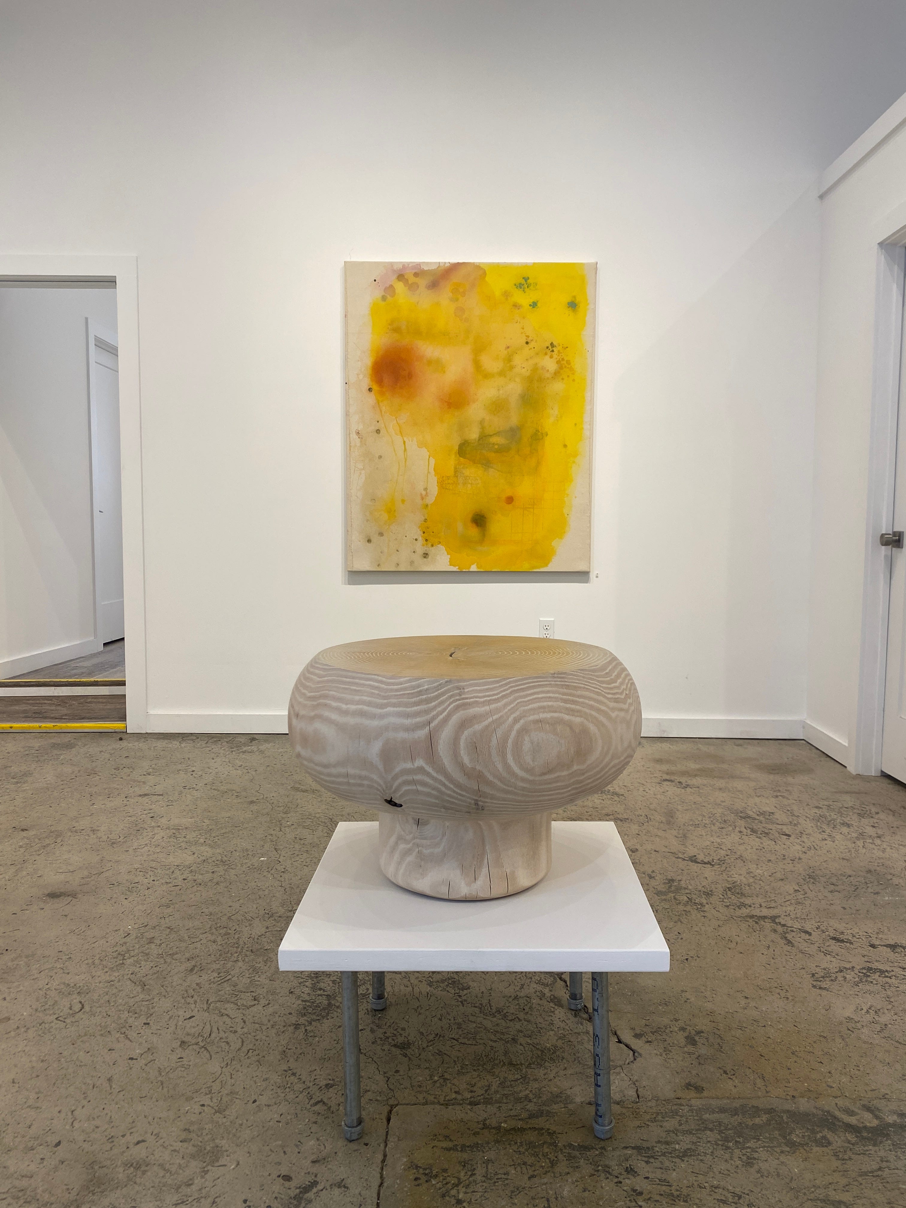
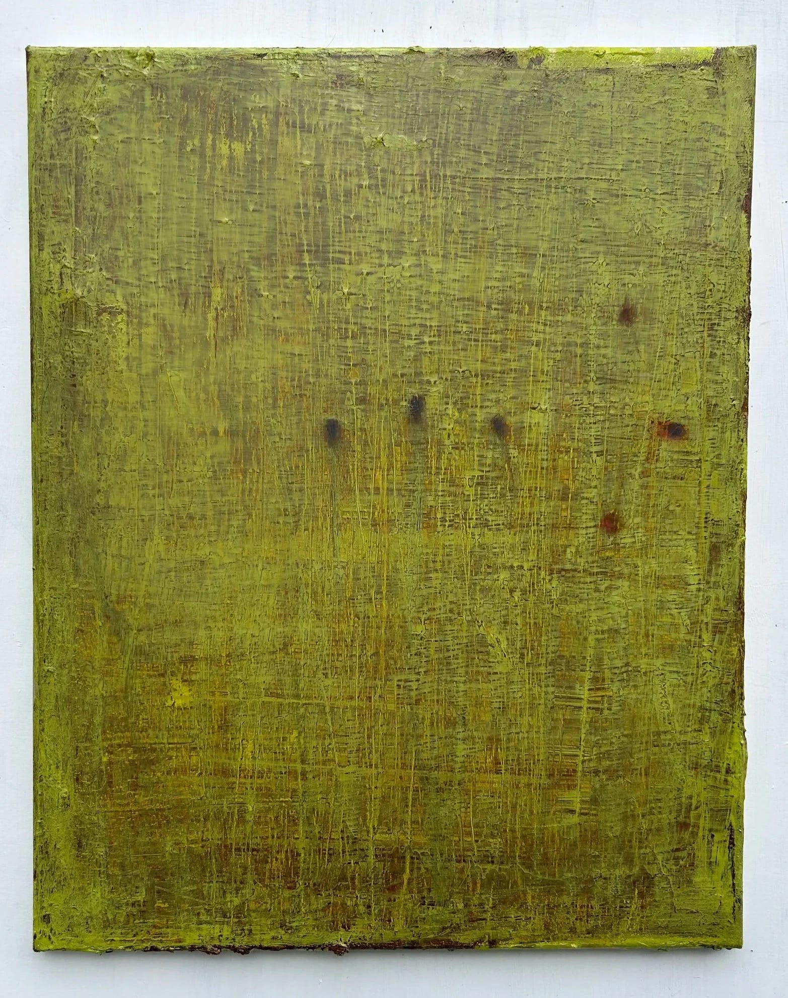
I work with geometry and intuition — I see them as connected rather than opposed. I don’t find geometry to be antithetical to feeling. You can make something geometric with a very strong connection to your kinesthetic sense of being in the world — rhythm, space. Geometry used in a certain way can convey a lot of emotion.I also want to comment on the paintings with very little paint on them — the light is extraordinary, like you’re staring into the sun. The canvas itself seems to give off light. And looking at the yellow painting [Ivy] and the blue-violet one [Spit-take] — could you describe your process and how it differs? Because these feel like a kind of printmaking — layered stages, with that final layer revealing everything accumulated beneath.
Sharon
Those are earlier paintings. I was lucky to be invited to the Golden Foundation, where I could use all the different products they have — as an individual artist, you can’t afford to buy everything. I had been using tubes of thick paint, mixing it into water, letting it sit overnight until it wasn’t lumpy. At Golden, they introduced me to fluid acrylics and a range of other products. The process has evolved, and those earlier works were among the batch made up at Golden.
Audience Member 3
So the light quality in those — you’re dealing with color as a layer, whereas in the others, the canvas itself is the bottom layer, and that’s where all the light comes from.
Sharon
Exactly. I really started to love the earlier stages of these works — they looked something like those at first, and then I went back and worked on them more. Eventually, I started responding to what was already on the canvas, rather than how many products I could use. (laughs) Experimenting with the products at Golden was an amazing opportunity, but what emerged was a greater responsiveness to the surface itself.
Audience Member 3
A couple of these are so musical — the way the circles are positioned, little notes moving in and out. There’s a real layering in time.
Sharon
Yes — there is that.
Audience Member (Speaker 4, returning)
I was thinking about that element of time in both of your works.
Jason
Time is something I think about a lot. Painting is atemporal by its very nature — so how do you make that level of time present in the work? For me, it’s about not giving it away too quickly. One reason I use subtle color relationships is so that changes are only apparent gradually. That’s how I use time in painting.
Ginny (Speaker 7)
Seeing the show from back here gives a wonderful perspective — the way the color has been curated gives this luminous flow through the secondary colors, the orange into the green, and then the scale of both of your works creates a kind of pulse. Sharon’s pieces feel close, and yours feel deep, and then it just completely flips — which makes for a fascinating experience of depth perception. And I can feel the landscape in the smaller pieces. There’s something almost Monet-ish in them, especially Sharon’s piece on the far wall — it’s a real centerpiece. They’re luminous, they’re beautiful. It’s a striking juxtaposition, these two artists. I love the way Alan curated the color.
Alan
It was interesting to find exactly the right pieces and place them within the space — allowing the color to move. The most difficult piece was the yellow painting; it really had its own gravity, its own moment. And the most interesting, almost accidental thing happened — David was with me — when we moved one painting and put the diptych next to it. It had been on the floor by accident, and I looked and said, wait a second. And it just became a permanent arrangement. It’s a beautiful wall. They’re extraordinary paintings — the depth, the surface action, the atmosphere. Both of you — there’s so much air in this work, so much atmosphere.
Ginny
A lot of air. A lot of air.
Alan
It works beautifully — it really does.
Sharon
It was a pleasure to come in and see the show for the first time — the installation was completely unexpected and beautiful.
Audience member
Well, that seems like a good place to end.
Applause.
“Spot on,” Sharon Butler, Jason Travers, and Kieran Kinsella in the Main Gallery; in the Front Gallery, work by Murray Hochman and Eileen Power. Curated by Alan Goolman. 68 Prince Street Gallery, 68 Prince Street, Kingston, NY. On view through March 8, 2026.